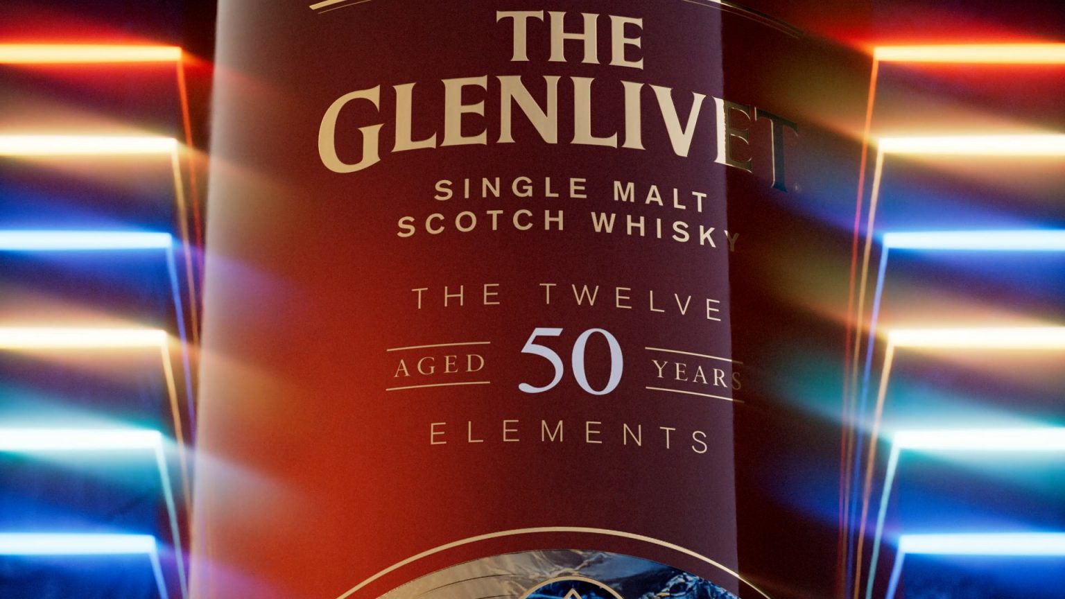
Luxury packaging expert Hunter Luxury has unveiled its latest collaboration is one of the most exclusive packaging launches in history – 12 bespoke wooden boxes for The Glenlivet: The Twelve Elements, a historic 50-year-old single malt whisky.
The collection consists of 12 unique bottles containing a blend of two casks of single malt whisky, aged since 1974 and bottled at a cask strength of 47.4%. Each of the 12 one-off bottles carries a unique label themed after one of the elements needed to make the finest whisky; air, barley, cooper, copper, the distiller, earth, fire, heritage, time, water, wood, and the angel’s share – the term given to the whisky lost to evaporation during the ageing process.
A fast-paced high-wire act
As luxury packaging designers, everyone at Hunter Luxury is familiar with exclusivity. The luxury sector is built on it – part of the appeal of any luxury product is the idea that you can own something very few people ever will.
When working on projects involving so few units, the stakes couldn’t be higher. On a regular packaging run, even in the luxury industry, issues like print registration errors, reprographics straying slightly outside tolerances, and small defects in materials can be frustrating. When working with a run of just 12 units, these small errors can become catastrophic, potentially wiping out a huge percentage of the total run. Designing packaging to be this exclusive, particularly on a high-profile project like The Twelve Elements, is a high-wire act with no safety net. Quality control, contingency planning, and material handling become mission-critical, and the margin for error does not exist.
Compounding this challenge was the tight time frame of the project, which had to go from concept to completion in under 3 months. It’s a task that required unbeatable agility, market-leading design expertise, and flexible supply chains. As we had worked with Glenlivet previously on a copper-inspired design for a limited 40-year-old whisky, the trust we had built with the customer meant Glenlivet had no hesitation in coming to us once again.
“I know it's easy to blow your own trumpet,” explains Barrie Hickmott, Senior Product Designer at Hunter Luxury, “but I don't think any other company could have done this as quickly and as effectively as we did.
“As the profile of the project was as high as it was, it was a nervous project from all sides - client included – at times, but the fact that we managed to execute it and still deliver within the time frame that was provided was something that I think only a company of our agility would have been able to execute. Other companies would have had to go through more hoops than we did, but because we had that strong relationship, the client worked very flexibly with us because they knew how risky this project was.”
A project built on trust
Projects of this nature, which require meticulous attention to detail, fine craftsmanship, and a rapid turnaround time, have to be a team effort. That doesn’t just apply to the team within Hunter Luxury – it includes the client team and their branding agency, which in this case was JDO.
“They put their neck on the line just as much as us in order to try and get this product to market,” continues Barrie, “so it was very much a team effort. Between us, Glenlivet, and JDO, everyone was heavily invested in delivering this thing in the way it deserved to be delivered.
“We had to collaborate reasonably closely with JDO through the entire process. There were times when we were given visual cues and instructions, but to manufacture it within the timescale and budget we had, we had to offer some different options. We always try to offer as many options as we can, but at the same time we are willing to guide our partners down the best path.”
The design process was completed quickly as our partners provided a comprehensive set of technical files that laid out the concept behind the packaging and the way in which it needed to be laid out. These files were easy to work into production-ready files with relatively few modifications to account for budget and the quick turnaround time. This means our team could keep the visual concept as close to the customer’s original vision as possible – and what a vision it was.
A perfect union of contrary elements
Ask most people how many elements there are, and they’ll reply with four; earth, air, fire, and water. Ask a chemist, and they might tell you there are 118 known elements on the periodic table. But anyone who knows their whisky will tell you there are 12 elements that go into the perfect dram. The Glenlivet: The Twelve Elements is a love letter to air, barley, cooper, copper, the distiller, earth, fire, heritage, time, water, and wood – everything that means each expression has its own unique, complex mix of flavour notes.
The twelfth element of the whisky-making process is the angel’s share, something that is familiar to most working in distilleries. The angel’s share is a poetic name given to the liquid that is lost to evaporation during the ageing process. As whisky is aged in porous casks, it’s said that around 3% of each cask is enjoyed by the angels every year until it is bottled. In the case of The Twelve Elements expression, this ageing process took 50 long years.
Each of these 12 elements has been represented by its own bottle of whisky, and each bottle has its own unique box design to match. The wooden boxes were finished with an all-over deep black and a high gloss PU lacquer. Achieving the kind of obsidian mirror shine we were aiming for on an MDF substrate without defects or damage proved to be one of the major technical challenges we faced during the project, but the end result delivered a stunning visual impact, with an almost hypnotically flawless finish you could get lost in for minutes at a time.
The pitch-black mirror effect is only broken by crisp gold lettering carrying the iconic The Glenlivet branding, created using metal decals applied beneath the lacquer. The front of each box also carries a bespoke brass amulet adorned with a symbol representing one of the 12 elements. After several rounds of prototypes, we settled on electroplated brass, which delivered the kind of quality results we always strive for.
The box’s interior featured the same attention to detail as its exterior, and saw us break new ground by using hydrographic printing on a project for the first time. Upon opening the box, the bottle was held in a custom moulded EVA insert topped with lycra for a plush matte look that contrasts with the high gloss exterior. The bottle is framed by a hydrographic printed ‘moat’ made using PMMA acrylic, adding a splash of vibrant colour that was matched to the label of each bottle. To make the moat really pop, we added a clear epoxy resin to create a raised effect, adding depth to the frame around the bottle.
The end result was a collection that, while made up of 12 utterly unique elements, was clearly formed from a single idea. That idea was single malt whisky and all that it represents. Simple and pure, yet complex and textured. A liquid that takes 50 years to produce, packed in a box that took just three months – a perfect union of contrary elements.
At Hunter Luxury, we understand that every mouthful of single malt is the result of centuries of expertise, skill, and passion that have been passed down through the generations. That’s because we take the same approach to packaging design, guiding our customers through a collaborative process until their vision has been achieved.
www.hunterluxury.com
