First impressions are everything. While this statement is a very well-worn cliché, there’s a very good reason for that – it’s true! And it’s particularly accurate in the packaging industry.
A consumer’s first impression of your product is often the difference that will sway them to either buy or spend their money elsewhere. And, in today’s market, being in a position to cut through the noise and make that vital impression is harder than ever. At a physical storefront, the average consumer notices just 15 POS materials out of every 450, according to recent research by NielsenIQ. From there, they’ll make their mind up in just 19 seconds on average.
What this means is that your packaging has a big impact to make and a tiny window in which to make it in. Every detail has to grab and hold the consumer’s attention. That’s something that takes a lot of experience and deep knowledge of show-stopping packaging development – and luckily, we have an abundance of both at New Vision Packaging!
We know the details that consumers notice about packaging and we know how to maximise their impact, learned through years of experience working on award-winning, innovative packaging.
Brand identity
From the moment consumers set eyes on a product’s packaging, they will instantly start making intuitive judgments about it. Bearing in mind the mind-boggling number of messages that bombards modern consumers, from POS displays to special offer notifications on their phones, your brand has a lot to compete with. The last thing you want your customer to feel in this environment is confusion – they’ll just move on from your product in a heartbeat. That’s why making sure your packaging fits your brand identity is the most important thing any company can do.
To use a well-known brand like Ted Baker as an example, its identity is all about elegance and simplicity. Were it to unveil a limited-edition Halloween-themed product, its packaging smeared with garish colours and cartoon monsters, it would probably leave its target customers more than a little nonplussed!
Now, that’s an extreme example, and isn’t meant to illustrate that cartoonish or edgy brand identities are bad – but they’re not for everyone. A brand’s identity is a key part of how it communicates and builds a relationship with the consumer. While it might be tempting to tie your brand into seasonal events and mix things up with something completely out of the box, you should make sure to retain some core element of your brand’s visual identity – a colour, a logo, the typography – to capitalise on that pre-existing consumer relationship.
Colour
According to a study by CCICOLOR, up to 90% of a customer’s initial judgment of a product is based on the colour alone. That makes colour management one of the most important details every good packaging solution needs to get right.
This isn’t as simple as choosing the most eye-catching colours and smearing them all over every pack. If it was, every store shelf would be a neon nightmare of fluorescent pinks and yellows. It’s about choosing the right colours to suit a brand’s identity and ensuring they are precisely reproduced wherever they are needed.
Colours can create an instant connection between a consumer and a brand – think of Coca-Cola’s iconic red, or Cadbury’s signature shade of purple – and absolutely form part of that vital first impression. Colours also provide a sort of ‘short hand’ that can clue a customer in about a product or brand they’re unfamiliar with. If an eco-friendly brand employs lots of green or rustic brown in its packaging, most consumers could intuitively pick up its sustainable messaging at a glance. At a time when, according to Explorer Research, the average consumer is met by 1.3 million words on the front of packaging every time they step into a supermarket, colour is a simple way to get your message heard.
If a colour is improperly reproduced, this creates a distinct off-brand look. However, colour management can get tricky when dealing with multiple substrates. Colour prints differently on a plastic insert than it does on a cartonboard exterior, for example, so it pays to utilise a packaging expert with a track record of colour management excellence. If your colours aren’t right, your message isn’t right, and your customers will be left cold.
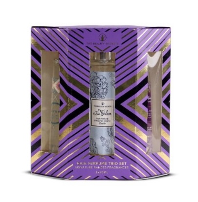
Silhouette
So many packs on shelf are made up of identikit flat oblong cartons, round containers, and limp flexible packs. And that’s... fine. But it isn’t likely to get a customer’s heart skipping a beat.
This drab landscape presents a real opportunity for a brand to make a splash with an outstanding packaging silhouette that instantly grabs a customer’s attention and makes them feel like they have the opportunity to purchase something special.
There are lots of ways brands can get creative with the shape of their packaging. This is where a versatile material like cartonboard comes into its own. In the right hands, cartonboard can be folded, flexed, and glued into almost any shape you can think of, and augmented with fantastic flourishes like varnishes and foiling. The New Vision back catalogue includes cartonboard Christmas trees, steam trains, colourful pencils and more, that all made a memorable splash on both physical and virtual storefronts.
Of course, this kind of extra packaging isn’t right for everything. It’s great for limited editions and gift sets but isn’t really feasible for all brands or everyday packaging. In the modern world, the throughput of long packaging runs is key for core product lines, and besides, not every brand identity is the right fit for zany novelty packaging. However, there is a lot a talented packaging designer can do to craft a striking on-shelf silhouette, even when working within the confines of a simple shape.
The key is adding a sense of depth to the pack – this helps packaging stand out and appear a little more high-end when compared to standard, flat-faced boxes – and can be accomplished in many ways. Techniques like embossing and debossing can subtly break up the outline of otherwise plain shapes, instantly drawing the consumer’s eye and interest. Tasteful use of apertures is also a great way to lend visual interest to packaging while also granting a tantalising glimpse of the product inside.
This can also be accomplished using accessories, like ribbons, bows, or swing tickets, which can provide extra visual impact and depth to an otherwise standard carton. Sometimes, these finishing touches can be the key differentiator – if your first impression on a customer isn’t memorable, they won’t waste time and will allow their interest to drift elsewhere.